Modernizing Event Discovery & Sign Up
Redesigning Elevation Church’s Outreach event discovery and sign-up experience to reduce friction and make serving easier to access for anyone wanting to volunteer.
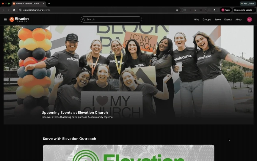
Website
5 Months
Lead Designer


Context
Less Time Searching. More Time Engaging.
Volunteers play a vital role within the Outreach department, making it possible for impact to be felt locally and globally. However, the existing event discovery and sign-up process was confusing, fragmented, required a separate account, and existed outside of the church’s main site. This created unnecessary friction for those eager to serve.
PROBLEM
If left unchanged, the current experience risked lowering volunteer turnout and weakening the department’s overall impact within local and global communities. With their largest annual event approaching, replacing the outdated system was critical to sustaining their momentum and meeting organizational goals.
GOAL
Enable volunteers to seamlessly discover and sign up for Outreach events directly on the church’s main site, reducing friction in the process and laying the foundation for future digital initiatives.
Research
Understanding The Problem
Through interviewing over a dozen guests and performing a heuristic evaluation of the existing system, I aimed to understand the frustrations and unmet needs that existed within the event discovery experience.
With over 70% of overall site traffic coming from mobile devices, improving the process was critical, as it played a direct role in overall sign up percentages.

Organizing the quotes and observations from interviews with an affinity diagram
DISSECTING THE EXISTING SOLUTION


RSVP button below the fold: Primary sign up action is located below the fold on mobile, requiring scrolling to complete the core task.
"Email Host" option doesn't look clickable: The ‘Email Host’ button lacks clear affordance or feedback, leading users to assume it’s non-functional.
Minimal filtering options: Limited filters dilute the users discovery experience, making it difficult to narrow events and increasing cognitive effort.
Clarity of adding a guest: The RSVP form lacks clarity when adding guests. No designation of guest type (child or adult) + no name required = unclean data/metrics
KEY INSIGHTS
The evaluation highlighted improvement opportunities within the existing experience. To produce impactful results, I needed to:
Increase visibility of core actions
Improve information clarity
Streamline decision making to simplify the RSVP process for volunteers.
Design
Crafting the Solution
Grounded in research findings, the design phase focused on reducing friction across the full volunteer journey: from event discovery through RSVP completion, while aligning the experience with broader platform modernization efforts.
Instead of optimizing isolated screens, the goal was to establish a scalable model that simplified decision-making and supported future growth.Design exploration was shaped by several critical constraints that directly influenced prioritization and execution:
LIMITATIONS:
Development resources were distributed across other parallel initiatives, including the hosting experience and the new account system.
The solution was required to be designed, validated, and shipped within a fixed, non-negotiable launch timeline.
Outreach events were the first experience built on a new backend infrastructure, introducing additional technical dependencies and coordination overhead.
SOLUTION EXPLORATION


Events List View: List view structure and hierarchy
Filters/Filtered List View: Filters overlay + filtered list view ideation
Event Details Page: Exploring event details hierarchy (headline, primary info, FAQs, etc.)
High Value Components: Ideation exploring "Fixed RSVP" and "Event Card" components
CONCEPT VALIDATION
Having a fixed location for the RSVP button allows for faster decision making and eliminates the need to scroll to the bottom of the page.
Filtering capabilities beyond date, time, and location allowed for faster, more informed discovery.
"Finally! Outreach is on the main church website."
Not displaying the amount of remaining spots (on the details page) makes it harder for users to make quick, informed decisions
Once a user signs up, the event card in their account does not display the number of children they are bringing.
Users are missing the ability to email a host.
HIGH IMPACT REVISIONS


Revised the detail page to include an "email host" button + indicators for remaining spots, age requirement, and if an even is full. Revised the event card component to show child count when viewed in the account profile.
USABILITY TESTING (FULL CONCEPT):
91%
Completed event sign-up without assistance
30/35
Found their prompted event using filters
94%
Accurately added children to their RSVP
Testing showed strong adoption of improvements across all primary flows
Minor UI adjustments were made to the list view and detail pages
Note - Participants also navigated a newly introduced account system; despite the added learning curve, results reinforced confidence in the improvements.
Final Design
Outreach Event Discovery & Sign Up
Find the Right Event Faster
Browse a structured event list designed to reduce scanning effort, clearly present information, and help users quickly identify opportunities that fit their needs.

Filter Without Losing Context
Apply filters through a focused overlay that refines results instantly, allowing users to narrow options without disrupting browsing flow.

Know What to Expect and Quickly Commit
Event details surface critical information upfront like availability, requirements, and the ability to directly contact the host, ultimately enabling users to quickly and confidently RSVP to an event.

From Decision to Confirmation
Once registered, RSVP details persist across the experience, showing in the users account, allowing users to quickly verify their attendance at any time.
Reflections
Impact & Final Thoughts
Launching ahead of LOVE Week, Elevation's largest annual initiative, the redesigned experience became the primary way people discovered and signed up to serve. By connecting discovery, context, and sign-up into a single coherent flow, the new experience removed the drop-off points that had suppressed participation in the legacy system. The results reflected both the quality of the redesign and the broader value of consolidating Outreach into an existing ecosystem.
MEASURED IMPACT DURING LOVE WEEK
27,453
Total volunteer sign ups (11% Increase)
49,965
Total volunteer hours served (7.3% Increase)
122
Unique cities served in (Across 12 countries)
FINAL THOUGHTS
This experience was one half of a coordinated redesign. The volunteer-facing flow and the event hosting system were rebuilt in parallel, and the decisions made on each side directly influenced the other. The outcomes were stronger because of that coordination, not in spite of it.
The consolidation created a foundation that extends beyond Outreach. With a unified platform in place, future features like self check-in (using geofencing), personalized event recommendations, and group sign ups have become feasible in ways the legacy system made impossible.